Naturally You: Process
Naturally You is a collaboration between myself, Mr.Fabulous, and Local Laundry.
LOVE NEST beer. Photo by Bryce Maruk
I came to know Mr.Fab through his initiative The LOVED. Collection. In Mr. Fab’s words:
“The LOVED. Collection is an evolving collection that collaborates with brands, business and companies to create a limited edition capsule collection to honor the stories, people and moments from our past and celebrate the successes and achievements the LGBTQ community has made towards equality.
With each collection, generous donations are made to a wide variety of groups who make it a daily mission to support and love the LGBTQ community.”
I was invited to design a label for the LOVE NEST Dandy Brew beer for the 2021 collection, and Ryan enjoyed my work enough to invite me back for round two. Local Laundry contributes an ongoing t-shirt to the LOVED. collection, however there was a want for a design unique to the 2022 collection. This is where I came in.
The brief:
This image is being printed on LL’s Natural Tee, and so we wanted the theme to play off this. “Naturally You” was decided on as a celebration of the authenticity, community, and intersectionality naturally present within the queer community.
The image is to depict the various people and relationships in our queer community in a celebratory and loving manner.
The image is to be silkscreened, so a limited color palette was decided. Mr.Fab came in with two colors that carry historical relevance to the pride flag. He says:
“In 1978, when some of the first Pride flags were being imagined, one concept created by a group of individuals led by Gilbert Baker included an 8-colour striped design. The flag’s fabric was hand dyed and sewn together to honour the feeling of community amongst the LGBT people and their fight for equality.
Hot pink for sex, red for life, orange for healing, yellow for sunlight, green for nature, turquoise for art, indigo for harmony, and violet for spirit.
In 1979, the Pride flag design was chosen as a symbol for the Gay Freedom Day Parade in San Francisco to honour activist Harvey Milk.
Unfortunately, Hot Pink fabric dye was in scarcity and could not be produced, so it was decided that the stripe would be removed from the flag. To further complicate matters, the Parade committee wanted to split the flag evenly along each side of the street and in order to keep it symmetrical, the turquoise colour was eliminated; giving us the six-coloured Classic Pride flag we know and recognize today.
In appreciation of our community’s past and to honour those who stood proudly, we have brought back the Hot Pink and Turquoise colours and utilized them in a design to show how we can continue to love thanks to their contributions.”
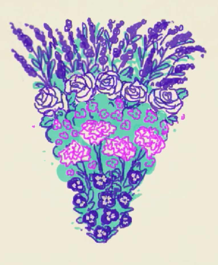
Rough rendering of queer’d flowers
With the brief in mind I set out to determine my illustration. I was feeling inspired by the historical symbology of the two selected colors, and when I thought about the ‘natural’ aspect of this project my mind went to the historical relevance of queer’d flowers. Symbology has long been a language used by queers, our secret code developed to protect ourselves and reveal ourselves to others who know the meaning of these symbols. You can see this in things such as flagging, or for my interest, in the use of flowers.
Rough rendering of queer’d flowers in triangle
There are several different flowers in the design of Naturally You. If you look closely, you’ll find roses, pansies, lavender, violet, and green carnation. Mike describes the background of choosing these specific flowers to be represented in Naturally You and why:
Pansy: Used as an insult used to disparage perceived weak or effeminate men in the 1900s, this was re-appropriated by the queer community as a self-referential and celebratory term.
Lavender: Another early insult aimed towards perceived queer men. Lavender became an identifying term by queers and their dissidents, especially from the 1950s-to 70s. Events such as ‘the Lavender Scare’, a witch-hunt perpetrated against queer government employees and “The Lavender Menace”, a term coined to describe lesbians.
Violet: Violets are linked to Sappho, a poet of Ancient Greece whose writings contained many erotic and romantic depictions of women adorned in flowers, including the violet. The use of violets was revived in the early 1900s as a depiction of sapphic love in the play The Captive which opened in Paris and New York. This play inspired Lesbians to wear violets to identify themselves with each other
Green Carnation: The green carnation was established as a queer symbol in the late 1800s. Oscar Wilde and his posse of queer men often wore one, and it became known to be worn by gay men to subtly communicate their queerness within the gay community.
Roses: Dyed roses are used in parades at weddings as a symbol of queer love and have become a way to honour the trans community. This recent development derives from the quote “Give us roses while we are still here”, which intends to honour and celebrate transgender people while they are alive, rather than fixating on trans death.
So with this I decided to do a cute little Queer Garden of Eden, full of cherub-figured people and flowers in bloom.
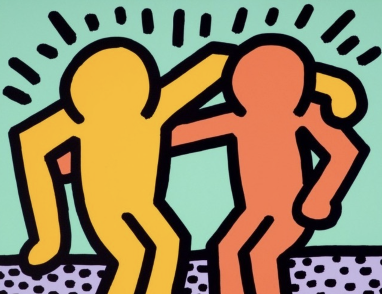
Art by Keith Haring
I knew with imagery involving figures I wanted it to be dynamic. Keith Haring is ALWAYS my point of reference for depictions of playful, dynamic, simplistic figures—-especially when they are interacting with eachother. While his are figures or universal humanity, I wanted to introduce specificity into my figures so they they felt like realized people, people that are relatable to our community. I took a lot of inspiration from who I’ve observed and encountered at events and in online sphere.
I decided to make many of figures are barefoot, grounding them in a community and connecting them to the natural world. The exception is the drag performer, whose shoes are a part of her identity. I depicted various relationships, romantic, platonic, familial—- because the community is full of all kinds of love!
On deciding the size, LL and Mr.Fab stated they wanted to use the whole shirt to showcase the design. Compositionally I went with a symmetrical floral arrangements, with the figures distributed throughout in a balanced manner.
This comp is where I landed, after throwing out a couple roughs. And this is the direction we ended up going in.
So now we have this cool, limited edition shirt available for purchase for the month of June.
A bonus? I got to pick our charity for shirt proceeds. I chose Calgary Queer Arts Society— they do a lot of rad things relation to queer art, but I especially want to support their Coming Out Monologues, a program that spotlights live queer storytelling and experience sharing.


